

Economic Update
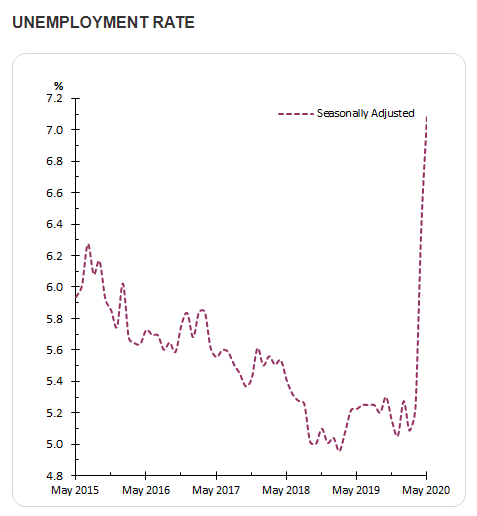
The global economy has experienced a severe downturn as countries have sought to contain the coronavirus. Almost every economic measure is quite frankly, awful. In our opinion unemployment levels best encapsulate the economic pain that is being felt now and will be felt in the future. In May 2020, the Australian Bureau of Statistics (ABS) reported seasonally adjusted unemployment levels went from low 5’s to 7.1%. Unemployment at the peak of the global financial crisis (GFC) was just below 6%.
City skyline
Photo By: John Doe
Button
Where are these rates going? The introduction of the JobKeeper payment has significantly reduced the number of job losses that would otherwise have occurred, but the Reserve Bank of Australia (RBA) still expects the unemployment rate to rise to around 10%. In addition, they also expect a decline in the participation rate. If realised, this would be the highest rate of unemployment since 1994.
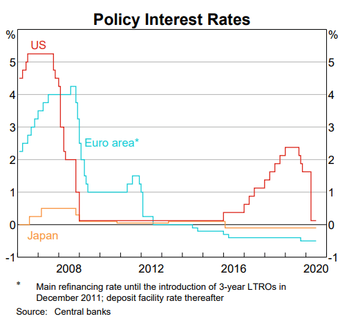
It is also interesting to reflect where interest rates were globally before the GFC unfolded.
Before GFC During GFC
Australia 7.25% 3.00%
USA 5.25% 0.25%
Euro Area 4.25% 1.00%
Japan 0.50% 0.10%
Switzerland 2.75% 0.125%
As you can see when the GFC hit, central banks had significant room to cut rates in order to stimulate the economy, which they did.
Now look at where interest rates before the global virus crisis (GVC) as compared to the GFC. As you can see, apart from the US there was basically no scope to cut rates at all. Yet this crisis is likely to be a far bigger economic shock.
Before GVC
Today
Australia 0.75% 0.25%
USA 1.75% 0.25%
Euro Area -0.50% -0.50%
Japan -0.10% -0.10%
Switzerland -0.75% -0.75%
The good news is that governments and central banks globally have been very aware of the scale of problems that will be caused by this pandemic. The co-ordinated fiscal and monetary policy response has been quite simply extraordinary.
Some context:
during the GFC central banks globally printed money – which is called quantitative easing (QE). How much did they print? Well in the US money printed is represented by the Federal Reserve’s balance sheet (see chart below) - the right-hand side of the chart is in millions represented by total asset of millions… which is trillions.
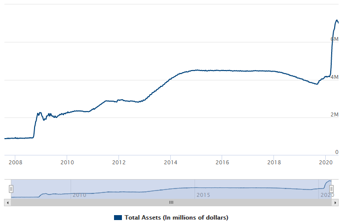
Before the GFC, the balance sheet stood at $870b. That increased to just over $2 trillion as the crisis unfolded. In the years following, it grew and by early 2015 it was about $4.5 trillion. By late last year, it had been reduced to $3.8 trillion as they unwound this program – this is called quantitative tightening (QT).
Not long into QT, cracks started to appear in the financial system and QE started again. Then the GVC hit. In the space of a few weeks this went to $7.1 trillion. So the money printed in the 11 years since the GFC was circa $3 trillion. Which is less than the amount printed in the initial weeks of the GVC.
Australia, which did not resort to printing money during the GFC, announced on 19 March 2020 that it too would begin QE.
In addition to QE, government’s globally have passed the largest fiscal stimulus packages ever seen. As shown below this is the size of stimulus packages as a percentage (%) of Gross Domestic Product (GDP) as at 20 June 2020.
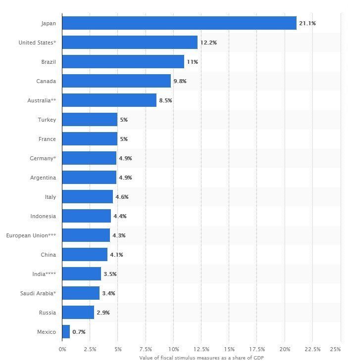
To put some context around this, the Australian stimulus package during the GFC was around $10 billion in 2008 and $42 billion in 2009. The current economic support packages to date so far have amounted to $259 billion.
I think it is important to stop and reflect what a trillion dollars is. A billion is 1,000 million, and trillion is 1,000 billion or a million million. So what does that look like? Credit to pagetutor.com for the images.
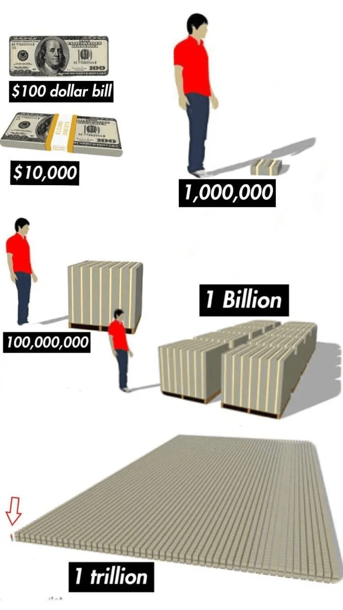
You may notice the spec in the left-hand corner. That is the same man in the red shirt and yes, those pallets are double stacked!
Where does all this money come from?
We are borrowing it. Countries issue bonds which are like IOU’s with interest. As interest rates are very low (and negative in some cases) the cost of servicing this debt is very low. However, as countries issue all of this extra debt, will there be enough demand to buy it? Demand is strong but a lot of that demand comes from central banks themselves via QE – which is artificial. Without this intervention by central banks it is likely that supply would exceed demand and therefore borrowing costs would be materially higher.
The obvious question is surely there are consequences to all of this… and yes there are.
The most common effect of QE from a technical basis is a reduction of the value of your currency. However, there are a lot of moving parts here. As an example, without QE it is likely that the economic downturn would be significantly worse, which also has a negative impact to your currency. Therefore, it may actually be better, at least in the short to medium term for your currency to print some money.
In addition, currencies are quoted on a comparative basis – i.e. when you quote what the Australian dollar is, you compare to the USD, Euro etc. Therefore, if everyone prints money, they can’t all fall relative to each other.
Inflation is also associated with printing money. But given the size of global demand shock (which has a deflationary effect) this is most likely not to be felt anytime soon.
Possibly the greatest risk is the voting population (and more importantly politicians) becoming convinced the answer to all our problems is to print money. History has shown that some amount of money can be printed without dire outcomes. In fact, it can even be a useful monetary policy tool when sparingly used. However, there are limits.
Unfortunately, no one knows where these limits lie, but it will be clear once it has been breached. Once crossed, there is no going back to the time before the breach was made to reverse the situation. Venezuela is the most recent example of using money printing in an attempt to solve other structural issues with their economy – sadly, the result has been an economic and humanitarian crisis.
Why isn’t printing money the solution to all of our problems?
Think of it this way - say you have 4 children and a 1 litre tub of ice cream in your freezer. Each child has $1 each which entitles them to 250ml of ice-cream. For those that want more ice-cream, they can either provide something that another child might want in exchange for all or part of their money, or of course make more ice cream.
Giving all the children an extra dollar will not result in them getting more. It will mean it just costs more (inflation) as you have more money chasing the same amount of goods.
There are really only 2 ways to lift a country’s standard of living. Increasing the productivity of the country and/or increase the country’s terms of trade – which is the price we sell our goods/services vs the prices we pay for other countries goods/services. Whilst we’d love to pay less for everything we buy and get more for everything we sell, so does every other country and therefore it usually comes down to supply and demand.
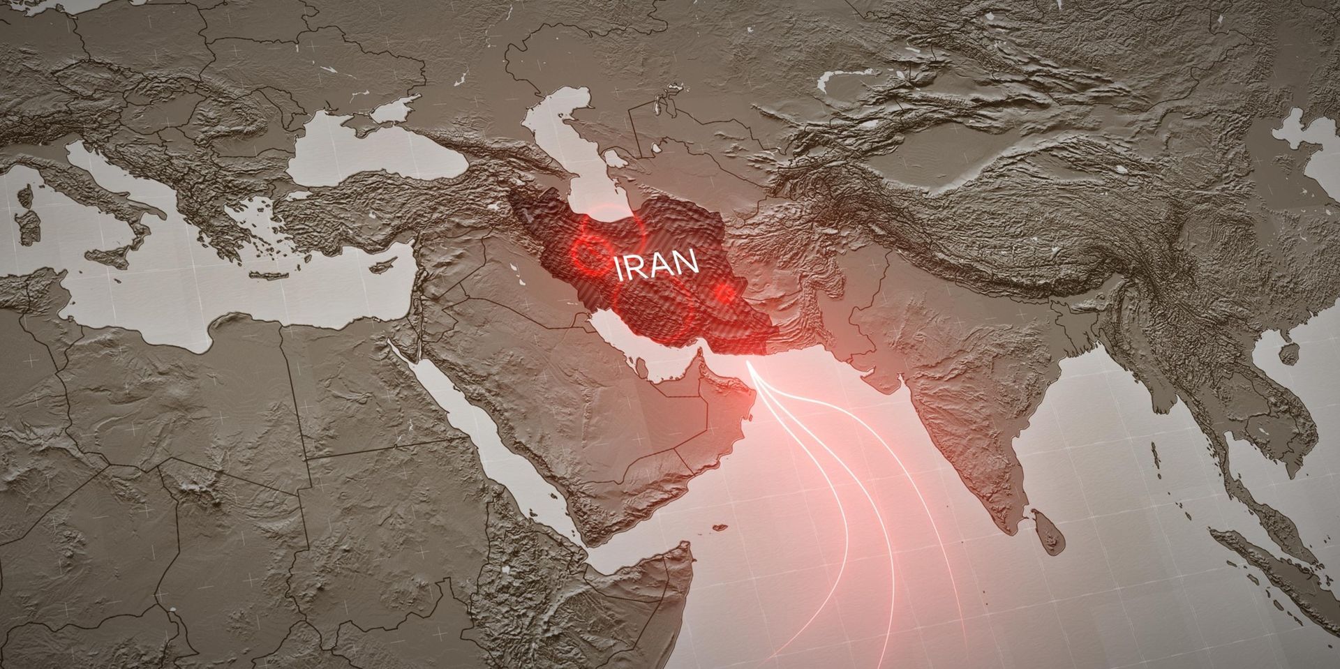
Middle East Conflict, Oil Prices & Market Volatility

Care in Retirement

Season's Greetings

Aged Care

Market Observations

Market Outlook

2025 Year in Review

Be Scam Aware

Productivity

Market Volatility ― “Liberation Day” Tariffs